Wayback Machine
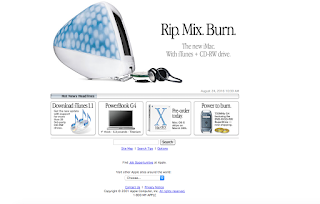
 Apple computers have changed from being big square cubes to being flat and lightweight. The layout is different on they're website. In 2001 the website had a bunch of pictures representing their different products. In 2016 Apple is showing just one big picture. In 2001 there was a bunch of text in black in grey mostly in one line. In 2016 there is only four words in black in grey in only one place in the website describing the product. In 2001 the website was a mess and didn't look like it was very usable in the sense of being able to navigate for certain products. In 2016 the website had a row of links at the top of the website so it was easy to be able to navigate to the type of products you wanted to look at.
In 2001 apple used a lot of META, LINK, and HTTP-EQUIV in they're code. In 2016 apple is using body, script, style, and div in they're code. In the code there is more differences in the breaking of the text using div.
Facebook has changed a lot not in just the name but also in the layout. In 2002 Facebook was known as about-face and you weren't able to login in. In 2016 the name is Facebook and you have your own login and password to your own account. The colors changed from blue, teal, red, and white to blue, grey, and green. The colors are more professional. In 2002 the font was about the same size, so you weren't able to tell which was headings and what wasn't if there wasn't color. In 2016 the headings is bolded, and there is a noticeable difference in font size.

In 2002 there wasn't a lot of code. In 2016 there was a lot of code. In 2002 most of the code was black so you couldn't tell what code went with which part of the website. In 2016 most of the code was certain colors that could tell you which part of the website it belonged to. In 2002 the code uses lot of meta, title, style, script, and link. In 2016 script, meta, content, and type are common words used in the code. The code that is used in one year and not the other includes title, content, link, and type.

In 2006 the website was really messy.The page was cluttered with a bunch of pictures and no overall theme. There were ads on the side displaying other websites. In 2016 there is on big picture with some words, and a side bar with different links to different pages for they're products. In 2006 if there wasn't color you probably wouldn't be able to tell what words went with which picture. In 2016 the words are pretty much the same color and font but it is easy to navigate because they are in a list format.

In 2006 the code included a lot of meta, script, link, body, and head. In 2016 the code includes a lot of script, link, and meta. In 2002 there isn't a lot of code because there most of it was links for pictures. In 2002 most of the code is black so it isn't easy to tel what art of the website it goes too. In 2016 most of the code is colored so it's easier to tell where it is in the website.


Comments
Post a Comment